Publisher: GLC
Exactly, we have utilized the set that Barthélémy Verand used for the printing of Triumphus translatez de langage Tuscan en François, (from "Triumph" of Petrarque) in the year 1514. Some letters, did not have, have been reconstructed to propose a complete alphabet. It appears that the printer used some letters to replace others, as V, committed make a A, or D to make a Q.
The original font's letters were drawn in white on a black background just, however it was appealing to propose an unfavorable version in black on white.
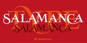
It is used as variously as web-site titles, posters and leaflets design, releasing texts appearing like ancient ones, or greeting cards, all various sorts of presentations, as an extremely ornamental, elegant and glamorous extra font.
This font supports strong enlargements staying really wise and fine. It's initial middle ages hight is about one inch comparable to about 4 lines of characters.
This typeface might be utilized with all blackletter typefaces, but works especially well with 1543 Humane Jenson, 1557 Italic and 1742 Civilite, with no metachronism.
Font Family: 1514 Paris Verand Normal
Tags: antiqued, blackletter, decorative, elegant, engraving, fashionable, garalde, graceful, greetings, historiated, incunabula, initial, invitation, menus, oldstyle, ornamental, poster, renaissance, retro, revival, smart, square, tc, textura, vintage, wedding, xmas