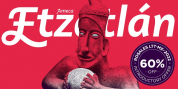
Publisher: Adtypo
Many sport publications missed a typefaces designed specifically for sport interaction conditions. We typically see only mechanically slanted or other synthetically damaged standard typefaces. I desired to fill this space and produce a system of typefaces, that will be used primary in sport.
It is usable for many prints - logotypes, publications, brochures, posters and so on. Flexibility of glyphs show adrenalinous shapes of modern bikeframes, skies or sportcars. Maximum open arches ensure great readability in really small sizes and avoided interchanges of glyphs „ o, c, e" per bad reading conditions. Softness of lowercase is at uppercase balanced in bottom arches, that are subtly kicked-up. Numerals are an important part of sport communication, so they have an expressive style, various from numerals of book typefaces.
Every font has 10 sort of numerals. Character case includes over 1000 glyphs, sport icons and othes signs creating the sport feeling. The title „ Akceler" represents acceleration, which is the particular attribute of this typeface.
Font Family: