«Back ·
ALAGE EVO & EVO CENTURY Font


 Designer:
 Manuel Lage
Publisher: LGF Fonts
A.LAGE typography was developed by Manuel Lage in 1992 to develop the logo design of the Printing A. LAGE, initially was not a typography, just five glyphs developed expressly, representing the press of a printing press, and the paper in the part central and hollow of each glyph, and an "L" representing the blades of a typographic machine Heidelberg, [which in turn was no more than a version of drawings of sources that I do to my note pads in the school, take benefit of sheeps]
Later, in 1994, the rest of the glyphs were specified, consisting of the "L", leaving the logo as a modified glyph and giving a personal touch to the logo design. Any variation of that type is offered totally free for personal usage by some websites.
That typography had different measurements, maybe less compensated, with less mindful measures, definitely by the more limited understanding of the author in those years. In 1996 work began to re-draw the glyphs, producing a typography (I believe it) much better compensated, called A LAGE LOGO DESIGN EVO, more attractive and with more personality.
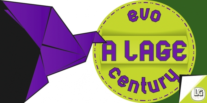
At the very same time that this work was done, a typeface appeared in which paper was more lead character, and inspired by the impact of papyrus or origami, with three-dimensional impact, and that might also be combined with the initial source, the two extra files called A LAGE EVO CENTURY, that although departing of the logo of our small printing house, is not part of the logo design (to this day) however is clearly part of the printing press established by my daddy. A number of versions were made and now this version (3.0) is ended up in the year 2016.
Font Family: Tags: decorative, effect, geometric, holder, logo, modern, origami, paper, parchment, poster


 A.LAGE typography was developed by Manuel Lage in 1992 to develop the logo design of the Printing A. LAGE, initially was not a typography, just five glyphs developed expressly, representing the press of a printing press, and the paper in the part central and hollow of each glyph, and an "L" representing the blades of a typographic machine Heidelberg, [which in turn was no more than a version of drawings of sources that I do to my note pads in the school, take benefit of sheeps]
Later, in 1994, the rest of the glyphs were specified, consisting of the "L", leaving the logo as a modified glyph and giving a personal touch to the logo design. Any variation of that type is offered totally free for personal usage by some websites.
That typography had different measurements, maybe less compensated, with less mindful measures, definitely by the more limited understanding of the author in those years. In 1996 work began to re-draw the glyphs, producing a typography (I believe it) much better compensated, called A LAGE LOGO DESIGN EVO, more attractive and with more personality.
At the very same time that this work was done, a typeface appeared in which paper was more lead character, and inspired by the impact of papyrus or origami, with three-dimensional impact, and that might also be combined with the initial source, the two extra files called A LAGE EVO CENTURY, that although departing of the logo of our small printing house, is not part of the logo design (to this day) however is clearly part of the printing press established by my daddy. A number of versions were made and now this version (3.0) is ended up in the year 2016.

