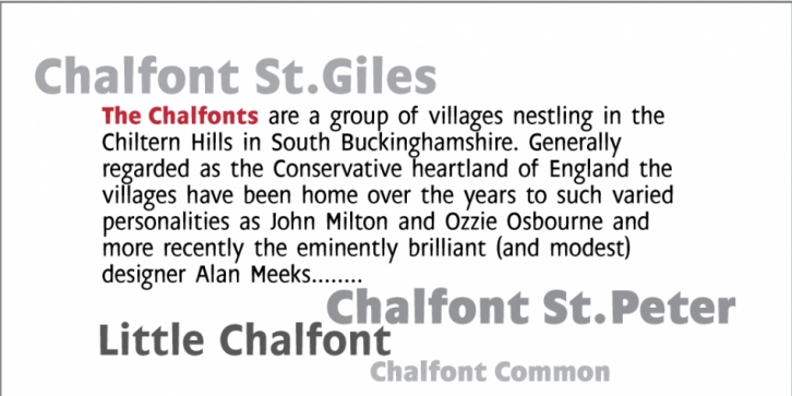


 Chalfont is a sans serif font style family. This typeface has 7 styles and was released by Alan Meeks Collection.
The typeface was created after seeing a photocopy of some News Gothic text where the ink had actually faded on the bottom of each character. As character recognition is generally based on the leading half of a character, readability was never ever compromised. Rather like Antique Olive the characters have a top heavy appearance when viewed directly on, nevertheless, as a lot of type is read at an angle with the top further away than the bottom this top heavy look is diminished.
Chalfont
© 2003 Created by Alan Meeks for AlanMeeks.com
All Rights Reserved.

