Designer: Alex Scholing
There is no contrast in the characters, which implies that the strokes are equally thick all over, hence 'Core'.
The terminals of characters like a, c, e and s point in a horizontal rather than a vertical instructions, which offers the typeface an open and available character, thus 'Humanist'.
' Sans' comes from 'sans serif' which suggests there are no serifs (the small - normally pointed - extensions at the ends of the strokes of traditional typefaces like TimesRoman and Garamond).
CoreHumanistSans is both appropriate for use in smaller text when it comes to headlines. The typeface doesn't communicate any specific 'environment' because it isn't made to suit any existing typeface category. One could say that it is rather neutral and unromantic however it does have a certain friendliness about it.
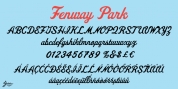
CoreHumanistSans comes standard with little caps, ligatures, alternative glyphs for a, e, g and E, arrows, old style numbers for text, lining numbers for tables and support for all Main European languages.
Font Family:
· Core Humanist Sans Light
· Core Humanist Sans Light Italic
· Core Humanist Sans
· Core Humanist Sans Italic
· Core Humanist Sans Bold
· Core Humanist Sans Bold Italic
Tags: accessible, clean, contemporary, friendly, monoline, neutral, open, rounded, sans