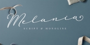
Publisher: Wordshape
Cruller is a display typeface that is based on an uncommon little lettering from a 1910 German lettering book.
What was the motivation for creating the font style? I discovered the base lettering years back in a specimen and scanned it. I've used it perennially for various metal bands' logo designs, and lastly decided to digitize it.
What are its primary qualities and features? It is a spidery little bit of lettering that would work well in Harry Potter films or on album covers.
Use suggestions: Show type for use in materials that are indicated to have a hand-wrought appearance circa the turn of the century.