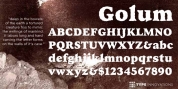
Publisher: Outside the Line
If you type caps and lower case you get one look. If you type all caps you get another appearance. Sort of 2 fonts for the price of one.
I choose to type caps and lower case and after that return in and fine-tune the heading a little to get the look I want.
Dearest John was seen in the 2011 Typodarium Page-A-Day Calendar on 12-9-2011.
Font Family: Dearest John
Tags: bouncy, cool, crazy, creative, cute, decorative, funny, graceful, hand, handletter, handwriting, handwritten, headlines, informal, initial, initials, lettering, marker, modern, sans-serif, uneven, unusual