Designer: Michael Jarboe
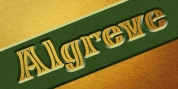
Stylistically, Enamel broadens on Sorren's timeless, ageless feel with the inline detailing exuding a feel similar to standard lettering and signage art. For more contemporary, experimental applications the two extreme layer styles can be used independently of each other extending its usage beyond tradition.
Features include:
Precision kerning
Standard Ligatures set including 'f' ligatures (ff, fi, fj, fl, ffi, ffj, ffl, ae, oe, AE, OE)
Discretionary Ligatures set consisting of (No [numero]
Alternate characters (Aringacute, hcircumflex, and numero indication)
Case types (shifts various punctuation marks as much as a position that works better with all-capital sequences)
Capital Spacing (worldwide changes inter-glyph spacing for all-capital text)
Slashed zero
Full set of numerators/denominators superior/inferior numerals
Tabular Lining, Proportional Lining, Tabular Oldstyle and Proportional Oldstyle Figures
Automatic portion function (supports any portion combination)
Extended language support (Latin-1 and Latin Extended-A)
* Requires an application with OpenType and/or Unicode support.
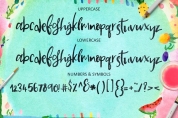
Font Family:
· Enamel Base
· Enamel Inline
· Enamel Line
Tags: capital sharp s, in line, inline, versal eszett