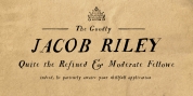
Designer: Jim Ford
Ernie has a savvy system of text animation built in; with dualing lowercase alphabets, 34 ligatures, and a substantial glossary of custom words, all configured to immediately make smart pseudorandom wordshapes. It's called RMS, aka the Randomagic System. The glossary of "buzz" words is based on the most common and effective words in marketing and advertising, along with words that specify to Ernie's desired uses.
Additionally, Ernie Alt supplies the opposite randomization effects in lowercase text, therefore reversing the rhythm of the bounce. Ernie Sorts is a perk font which includes enjoyable printers fists, expandable banners and other graphic elements.
The Ernie character and animations were developed by Johnny Sampson, as a visualization of the typeface, it's character and it's special functions.
Font Family:
· Ernie
· Ernie Alt
· Ernie Sorts
Tags: 60s, 70s, ad lib, alternates, animation, bold, bouncy, broadcasting, cartoon, casual, children, clarendon, comical, contextual, display, energetic, ernie, freeman craw, fun, happy, headlines, informal, jim ford, kids, ligatures, logo, manicule, nostalgic, opentype, packaging, party, poster, pro, quirky, random, relaxed, retro, serif, slab