Designer: Olcar
Alcaide
Designer: Olcar
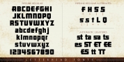
AlcaideFortezza is a family of font styles motivated by the terrific masters of the Modern Roman design: Firmin Didot (1764 -1836) and Giambattista Bodoni (1740 -1813).
.Both typefaces can be similar, but a skilled and close vision, reveal clear differences in the final result, like its weight and the degree of shift of the strokes. The kind of Didot suggests greater warmth and beauty, they are defined by extreme contrast in thick strokes and thin strokes, by the usage of serifs extremely thin and by the vertical stress of the letters. while the Bodoni type communicates a greater robustness and solidity.
.Fortezza unites the sophistication and spirit of both types, but proposes a modern vision, developing a range with particular features common of the baroque that appeared at that time.
.Font Family:

![[Spring Vibes] Splendor font download](thumbs180/13291_0.jpg)