Designer: Jason Smith
FS Matthew is a multi-talented typeface.
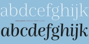
A clear, elegant and structured sans serif with stroking curves of openness which produce a dynamic, flavourful character. Unforeseen drama in information such as the reaching curve of the g and y, the shape of the u, and the off-kilter k, v and w all
build-up the fonts character. Generous counters and a slightly condensed element come together to make it extremely legible and space-saving in text or title sizes. A structured system for solid corporate identities, signs systems, logotypes, screens, sites and billboard ads. An all round multi-talented typeface with a feel-good aspect-- radiant, efficient and sound.
Font Family:
· FS Matthew Light
· FS Matthew Light Italic
· FS Matthew Regular
· FS Matthew Italic
· FS Matthew Medium
· FS Matthew Medium Italic
· FS Matthew Bold
· FS Matthew Bold Italic
Tags: clear, curves, efficient, feel good, flavour, generous, lively, open, swoopy