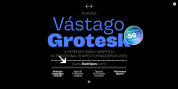
Designer: Juan Siwak
The poster itself is the language of graphic design, and geometry is its ally.
This font style goes for that objective. It has 2 variants that derive from its source. Imperio Giga Black attempts to be a negative typography, beginning with the black and then looking for small windows in which they begin to reveal the morph. This is a severe and modern typeface. Imperio West is a transformation of the original one, with decorative information which change it into a typeface of wood and saloon typeface.
In all cases we advise its usage in large sizes (approximately 20pt) and primary titles. Imperio UltraBlack can work in smaller sizes than Imperio Routine.
Font Family:
· Imperio
· Imperio UB
· Imperio Giga Black
· Imperio West
Tags: 1940, cool, geometric, modern, narrow, poster, rectangular, rock