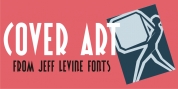
Designer: Jeff Levine
Square in shape, with unique stylization to some letters, Jalopy JNL can cross the decades and be utilized for a 1920s duration piece and still look fresh in an ad for computer parts.
Rather than round out the within lines of the characters to fully replicate the strokes of a lettering pen, the inside lines have straight intersections for the modern side of this font's style.
Font Family: Jalopy JNL
Tags: 1920s, decorative, display, hand lettering, headline, pen lettering, retro, rounded ends, square, vintage