Designer: Dusan Jelesijevic
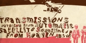
The Kamenica river is just a couple of meters large. Mainly shallow and cold, clear and green, it was the direct inspiration source for the production of this condensed typeface. As our other typefaces, "Kamenica" also integrates traditional shapes with modern kinds, tall x-height and a collection of more than 300 glyphs.
Comparing the river with the font style, we could state that letters are the fishes that resides in the Kamenica river and that the font weights are the seasons in which this river shows many of its own character.
Font Family:
· Kamenica Light
· Kamenica Regular
· Kamenica Bold
Tags: condensed, display, headline, legible, narrow, poster, retro, river, sans-serif, sans serif, text