Designer: Adrian Talbot
It includes old design non-aligning (lower case) numbers, both proportional and tabular as well as accented characters for Central European languages.
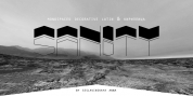
The Kettering 105 family makes up of five weights and is closely related to Kettering 205, it's more intensely Deco flavoured cousin.
Font Family:
· Kettering 105 Thin
· Kettering 105 Thin Oblique
· Kettering 105 Light
· Kettering 105 Light Oblique
· Kettering 105 Book
· Kettering 105 Book Oblique
· Kettering 105 Bold
· Kettering 105 Bold Oblique
· Kettering 105 Heavy
· Kettering 105 Heavy Oblique
Tags: avant-garde, avant garde, block, bold, clean, contemporary, elegant, geometric, glypha, headline, heavy, legible, lubalin, magazine, mechanical, metro, modern, modernism, museo slab, neutraface slab, newspaper, non-aligning numerals, old style numerals, packaging, poster, round, serif, signage, slab-serif, slab serif, stylish, text and display, webfont