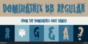
Designer: Hubert Jocham
The shapes appear to be built with circles and squares. DIN Mittelschrift is one very famous example, or the typeface on the old German vehicle number plates.
Since the Romain du Roi we know that it is difficult to draw a geometrical typeface.
For optical factors you need to go away from circles and lines with exactly one weight.
Therefore the aim is not to construct a typeface but to draw it the method it seems constructed lastly. The style of a typeface resembles stage production. Like heavily comprised actors the characters of a typeface must be overemphasized to work well. Especially in small sizes.
Font Family:
· KonsensSten Light
· KonsensSten Book
· KonsensSten Regular
· KonsensSten Medium
· KonsensSten SemiBold
· KonsensSten Bold
· KonsensSten Heavy
· KonsensSten ExtraBold
· KonsensSten UltraBold
Tags: clear, constructed, contemporary, corporate, german, industrial, magazine, modern, sans-serif, sans serif, squarish, stencil, technical