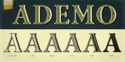
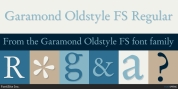
Designer: Jeff Levine
The capitalized part [' Castles in the Air'] was a hybrid mix of a couple of Art Nouveau-influenced rounded letters, yet together with this were squared letters with rounded corners (reflecting the upcoming Art Deco motion to take place in about another decade).
As a total alphabet, it didnít mix in addition to in those couple of brief words. What to do? It was decided to go with the squared look and conserve the rounder characters for a future project.
The end result became Last Date JNL; readily available in both regular and oblique variations.
Font Family:
· Last Date JNL
· Last Date Oblique JNL
Tags: 1900s, art deco, art nouveau, decorative, display, hand lettered, headline, nostalgic, retro, sans serif, vintage