Publisher: CheapProFonts
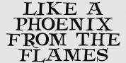
A new typeface in the design of a dot matrix/needle-printer. I have actually utilized some somewhat smaller sized dots when creating the diacritics - this makes them simpler to separate from the main letters. I have likewise used variable letter widths (and kerning), rather than the technology's original monospaced design - this to make the text more legible:)
.Font Family: Matrise Pro Regular