Designer: Piotr Łukaszkiewicz
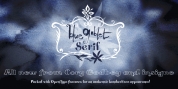
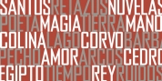
Mezalia has two unique styles: straight and cursive (real italic if you will, although the word is not truly correct here), which come in seven weights, from thin to black. Each weight contains a set of old-style figures, lining figures, little caps and ligatures. A different style including drop-cap initials is also readily available.
Font Family:
· Mezalia Thin
· Mezalia Thin Cursive
· Mezalia Extra Light
· Mezalia Extra Light Cursive
· Mezalia Light
· Mezalia Light Cursive
· Mezalia Regular
· Mezalia Cursive
· Mezalia Bold
· Mezalia Bold Cursive
· Mezalia ExtraBold
· Mezalia ExtraBold Cursive
· Mezalia Black
· Mezalia Black Cursive
· Mezalia Initials Regular
Tags: 80% off, blackletter, broad nib, cursive, discounted, drop cap initials, initials, ligataures, lining figures, medieval, modern, old-style figures, proportional figures, retro, serif, small caps, text, true italic