Designer:
 Andrea Leksen
Publisher: Leksen Design
was designed by Andrea Leksen and published by Leksen Design.
Mr Gabe contains 8 styles and family package options. The font is currently #43 in Hot New Fonts. p>PHTMLCheck out
Mr Gabe in motion! Currently 50% off introductory offer. PCHTMLPHTMLPCHTMLPHTML
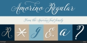
Mr Gabe is a typeface designed to dance. Not that it's a flamboyant display face, but that it has a liveliness, especially in its heavier weights, that dances across the page. And the letters include a selection of exuberant flourishes that can be used to kick up a ruckus or make a sweeping gesture.PCHTMLPHTMLPCHTMLPHTML
Mr Gabe is a high-contrast serif typeface with vertical stress, a "modern" face in traditional type terms. Even in the regular weight, the contrast between thick and thin strokes is very obvious. Designer Andrea Leksen has given many of the lowercase letters ball terminals, teardrop shapes that make
Mr Gabe seem decorated even when most of its letter forms are conservative.PCHTMLPHTMLPCHTMLPHTMLIf you need more bells and whistles, or perhaps revolving mirror balls and dancing shoes, you can explore the font's collection of ornaments and decorative borders.PCHTMLPHTMLPCHTMLPHTML
Mr Gabe comes in four weights, from Regular to Black, with italics for each. Each font includes over 57 ligatures, 31 illustrations and borders, small caps and proportional oldstyle numerals.PCHTML
Font Family:·
Mr Gabe Regular·
Mr Gabe Italic·
Mr Gabe Semibold·
Mr Gabe Semibold Italic·
Mr Gabe Bold·
Mr Gabe Bold Italic·
Mr Gabe Black·
Mr Gabe Black ItalicTags: alternates, beautiful, black, bold, borders, brand, collection, connected, connection, contrast, dance, decorative, display, dramatic, elegant, family, high contrast, illustrations, italic, ligatures, logo, magazine, ornaments, packaging, serif, sophisticated, sweet, tango