Designer: Natanael Gama
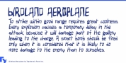
Nazaré fits in a semi-serif classification and it has a large contrast. It works outstandingly in screen usage specially in the bolder weights that have a lot more contrast. The regular weights have a more moderate contrast and a general less lavish design, fitting finest in the typographical conventions. this provides a better render in text usage.
You can use this font in large headlines, logos, posters, book covers, and general display use in addition to short strings of text.
Nazaré is the name of a little Portuguese fishing village understood for its giant waves and peculiar people.
Font Family:
· Nazare Regular
· Nazare Medium
· Nazare Semi Bold
· Nazare Bold
· Nazare Extra Bold
· Nazare Heavy
Tags: 20s, 30s, 40s, 50s, bold, decorative, display, extravagant, headline, heavy, high contrast, poster, retro, semi-serif, semi sans, semi serif, vintage