Designers: Lars Cellini, HP Becker
Or 32.0 lb of potatos.
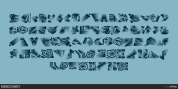
Every single letter, every digit and every symbol. Manually, of course, and care-fully. It took a while. Longer than digitizing it, but considering that we love terrific quality, we put just as much care into this process.
Font Family:
· NCO Potatoe Clean
· NCO Potatoe Rough Regular
· NCO Potatoe Extra
· NCO Potatoe Symbols
Tags: ancient, antique, cat, catchwords, cut, cutted, decorative, design, diacritics, dirty, distressed, eroded, extra, german capital sharp s, grotesk, grotesque, grunge, hand, handmade, headline, hipster, inline, layer, layer-type, layers, letterpress, logotype, multilingual, new cat orange, outline, potato, potatoe, press, print, printed, printing, retro, sans, sans-serif, shade, stamp, stamping, symbols, texture, vintage, weathered, worn