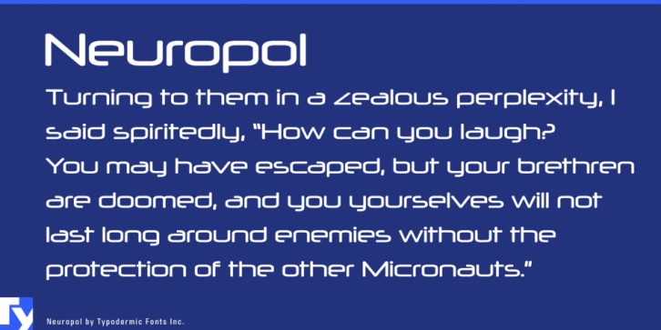


 Neuropol is a display screen sans font released by Typodermic Typefaces Inc.
Neuropol is a broad, starkly futuristic typeface which was developed in 1996. The style is based on rounded squares which were popular in earlier techno typefaces such as Microgramma, Digital and Chimes. The superelliptical stroke ends offer Neuropol a harmonized appearance. Truncated horizontal strokes suggest lasers or vector-beam traces.
Over the last couple of years, several Neuropol related font families have actually been launched. Neuropol had been redrawn and broadened into Neuropol X in 2004. The original Neuropol font was discontinued at that time but some people still prefer the 1996 version.
In 2015, the original 1996 Neuropol was brought back and re-released. Changes consist of: better kerning, greater dots on i and j, cleaner curves, much heavier accents, more languages, more punctuation, the most recent monetary symbols and a better @ symbol. If your application supports OpenType stylistic alternates, you can access a total Z, similar to the one in Neuropol X.
Font Family: Neuropol Regular
