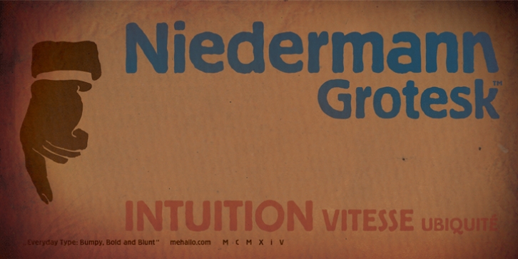


 Niedermann Grotesk was designed by steve mehallo and released by steve mehallo. Niedermann Grotesk consists of 1 style. p > With the printing of the Futurist poem "Zang Tumb Tuuum" in 1914, modern-day art had taken a typographic twist: "words in flexibility" (parole in libertà) were now a significant part of the art world. The avant garde followed suit.
Niedermann Grotesk is based on the everyday type that appeared in early modernist collages, journals and manifestos. It is a peculiar style of lettering-which was originally inspired by the Sachplakat (object poster) work of Lucian Bernhard-and adapted for hot metal in 1908 by Heinz Hoffmann. 100 years ago, the design became a workhorse of the German printing industry.
Niedermann Grotesk is an upgraded variation, referencing the initial poster art, each letter carefully drawn with an old brush. Rough, strong and blunt-with a suite of alternate characters and a few dingbats-Niedermann Grotesk is ideal for marketing, product packaging, poetry, art, demonstrations and retro homage.
Font Family: Niedermann Grotesk
Tags: 1900s, 1920s, 1930s, advertising, art deco, block, blunt edges, bold, commercial, cubism, dada, decorative, display, fashionable, futurism, german, gothic, grotesk, grotesque, hand-drawn, handmade, headline, heavy, industrial, lettering, magazine, modern, old-fashioned, plakatstil, poster, retro, rough, sans-serif, signage, vintage, worn
