Designers:
 Rafael Neder, Francisco Martins
Publisher: This is Not Typography
was developed by Rafael Neder, Francisco Martins and published by This is Not Typography.
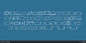
Nova Sans contains 1 design. p > NovaSans is a modern geometric sans-serif typeface which catches the spirit of Bossa Nova, a worthy Brazilian music design. Music and typography provides a number of things in commom, so the concept behind the font style is show some of bossa nova's attributes, like tune, cadence, softness, metric, simplicity, waves, subtleties. Some spaces in representing the source of irregular alignment scores.
NovaSans also was picked for Tipos Latinos Bienal, in the Display faces category.
NovaSans was developed with a modular system. Its whole set offers almost 280 glyphs with alternates, dingbats and ornaments.
Conceived to be utilized as a display screen typeface, NovaSans is suggested for use at big sizes.
Font Family: Novasans
Tags: alternates, bauhaus, bossa nova, dingbats, display, future, geometric, ligatures, modern, modular, musical, opentype, poster, sans-serif, swash capitals, swiss, waves