Designer: Gareth Hague
As with other Alias typefaces, Sabre has stone and wood cut letterforms as a beginning point. What is fascinating about lettercutting is the connection between shape and material. These perfectly crafted letterforms have a particular sharpness which reflects, naturally, how they were made.
The concept of constructing letters from a set of parts we first checked out in early fonts Elephant and Factory. These are various because they were very much grid-based, with a geometric structure. For Sabre I also had Fred Smeijers' stencil construction drawings in mind. These demonstrate how a set of parts can be the basis for a crafted, classy typeface. Sabre is quite a loose interpretation of this idea.
Sabre's graphic shape suggests it works well at big sizes, with a significant, angular effect. Its goal is to be typographic enough to work for blocks of small-size text too.
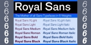
Font Family:
· Sabre Light
· Sabre Regular
· Sabre Medium
· Sabre Bold
· Sabre Black
Tags: engraving, graphic, incised, serif, wedge serif, wood cut