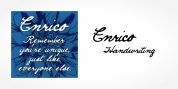
Designer: Josep Bellart
Neutral and universal are two words that could describe a sort of excellence. The search for neutrality and universality is part of history in type design; it was specifically essential in the so-called Swiss Style. Samplex is a typeface that joins this specific search. The design gets rid of unnecessary aspects and keeps away from design conflicts.
The big and somewhat condensed body of lowercase letters makes Samplex a good option for long paragraphs, and specifically proper for screen gadgets. Letters with a blocky appearance offer shape to a text in ideal order, suitable for grid enthusiasts and designs with a rigorous structure. The style of Samplex is clean and effective. The diagonal cuts are booked to the italic letterforms, setting some range in between the strong upright characters and the dynamic oblique forms.
Font Family:
· Samplex Hair
· Samplex Hair Italic
· Samplex Thin
· Samplex Thin Italic
· Samplex Light
· Samplex Light Italic
· Samplex Book
· Samplex Book Italic
· Samplex Regular
· Samplex Regular Italic
· Samplex Demi Bold
· Samplex Demi Bold Italic
· Samplex Bold
· Samplex Bold Italic
· Samplex Black
· Samplex Black Italic
Tags: advertising, blog, branding, business, business text, clean, commercial, contemporary, corporate, display, editorial, geometric, grotesk, headline, magazine, neutral, news, packaging, sans, sans-serif, screen, swiss, technical, web, website