Designer: David
Kerkhoff
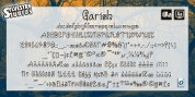
Designer: David
KerkhoffI was listening to an Opeth album called Blackwater Park. By the time I had actually chosen that this typeface needed some swirls, the band was playing a song called The Drapery Falls - which has the word 'spiraling' in it (see poster 2) - and the name was born.
Spiraling down is a surprisingly sophisticated font style (offered its roughness). I most likely wouldn't set an entire text in it, but it will actually stick out as a titling typeface for packaging or book covers.
Font Family: