Publisher: CheapProFonts
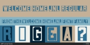
I just liked the style idea behind this font style, however the initial font had a great deal of unsightly artefacts - so I have completely redrawn ALL the letters, prior to expanding the character set. The lowercase have been redrawn with a higher x-height, making the font style a lot more useable (with more "normal" word shapes;)
.Font Family: Syndrome BRK Pro Regular