Designer:
 Patrick Griffin
Publisher: Canada Type
was designed by Patrick Griffin and released by Canada Type.
Tabarnak includes 2 styles and family package alternatives. p >
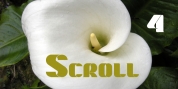
Tabarnak began as an assessment and correction of an old concept by George Wilkens. The original idea was for a strong upright alphabet reminiscent of Oz Cooper's work, but ornamented with some shocard/signage traits. That concept was significantly redrawn and reinvented to become an easy 21st century font style made to turn heads and cause a friendly rush. Tabarnouche is
Tabarnak's "tense" incarnation.
Just as excellent for product packaging as they are for advertisements, posters, book and magazine covers, both Tabarnak and Tabarnouche include about 600 characters, consisting of lots of alternates, and support for most of Latin-based languages.
Font Family:
· Tabarnak
· Tabarnouche
Tags: action, alternates, athletic, bold, canadian, car, cool, decal, edgy, fast, friendly, futuristic, geometric, logo, magazine, minimal, pointed, quick, speed, sport, techno, video game, wild