Designer: Oleg
Karpinsky
Designer: Oleg
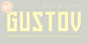
KarpinskyThe name of the font style Titla stresses its heading and show performance. At the exact same time, low contrast, narrow proportions, large variety of weights and clear glyph buildings make it possible to use it for long texts as well.
The mix of contemporary serifs with bending stems (see n, p, ...) brings fresh, informal and obvious look to the font.
The character set includes alternative variations and specific ‘‘ vertical ligatures' for paired letters that are constructed with the assistance of diacritical forms of letters positioned above standard ones. This feature also was shown in the name of the typeface as Greek ‘‘ titlos' methods diacritical mark.
The typeface was designed by Oleg Karpinsky and launched by ParaType in 2009.
Font Family: