Designer: Markus Reiter
To get a crisp appearance this font ought to be used at 10 pt or multiples of 10 pt. (A tip for Adobe Creative Suite applications is to change the standard anti-aliasing approach from "sharp" to "crisp" and to align the text to entire pixels. Also avoid centered text.)
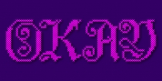
To get going with type design I thought it was best to begin with a pixel font due to the fact that you don't have to focus much on the style itself, but rather have to focus on how kerning and spacing works and the different functions you can carry out with OpenType. And of course I wished to have a pixel font that had all that I was missing out on from other pixel fonts.
We were learning trigonometry at the time I began designing Trigomy, and the majority of the time I misspoke it "trigometry". So, when I needed to create a name for my very first font style I believed: 'Why not go with Trigomy?'
Font Family:
· Trigomy
· Trigomy Outline
Tags: angular, arcade, flash, geometric, grid, pixel, pixel font, pixelfont, proportional, rectangle, rectangular, retro, square