Designer: Henning Brehm
As a font designer for movies Henning Brehm delivers typefaces with a whip-sharp eye for precision. His newest Vette Letters release, VLNL Agitka is a Cyrillic-inspired (and including) alphabet with both feet rooted in Soviet Union-era propaganda posters. Its style is constructivist (appearance Mama, no curves!) geometric and strong. Like Russian vodka. Aside from the Regular, Light, Bold and Black weights, Agitka is available in four Neon designs also. For a dazzling style result, layer those neons over a routine weight for a star struck embossed-letter effect.
We would likewise like to mention the usage of VLNL Agitka in the Bourne Ultimatum movie, for which Brehm designed neon signage for a scene at a Russian grocery store. За здоровье-- Za Zdarovje!
Font Family:
· VLNL Agitka Light
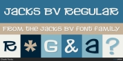
· VLNL Agitka Regular
· VLNL Agitka Bold
· VLNL Agitka Black
· VLNL Agitka Neon Regular
· VLNL Agitka Neon Black
· VLNL Agitka Neonbox Regular
· VLNL Agitka Neonbox Black
Tags: constructivist, cyrillic, cyrillics, geometric, neon, no curves, revolutionary, russian, sans, sans-serif, soviet union, vodka