Publisher: CheapProFonts
A nice, black screen face - for a retro/western poster look. I have actually kept the quirky "t", increased the dot above "i" and "j" somewhat, improved the spacing/kerning and modified/added all the normal diacritics. A quite simple reworking of a good quality font.
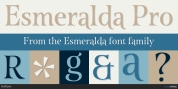
Nick Curtis states: "An old favorite, Bernhard Antique Bold Condensed, tidied up and fattened up. Warm, captivating, personable and suitable for any event."