

 Designer:
 Jeroen “Joebob” van der Ham
Publisher: JOEBOB graphics
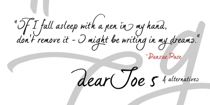
After months of sketching, drawing, tracing and kerning I am happy to provide a brand-new member of the dearJoe family: here's
dearJoe 5.
This one was created by writing all characters with a thick HB pencil and then tracing them very tightly, which led to a more clean and built look than the previous dearJoes and it also discusses the typeface having rounded corners here and a pointy end there: a pencil's point tends to vary its shape due to the fact that it constantly wears down a bit when composing with it.
The font style includes a little curly sibling to provide you with a complete alternative alphabet to experiment with. If you wish to create plain text,
dearJoe 5 will do fine, however in case you would like -let's say- a header above that text with a bit more appealing upper case or a bit range in lower case, just exchange the
dearJoe 5 character with the one that is in the alternatives font style and you will be happily surprised ... a little manual kerning between the two might be needed though.
DearJoe 5 consists of all the special signs,
dearJoe 5 options only consists of characters.
Font Family: Tags: calligraphy, certificate, connected, curly, decorative, elegant, graceful, hand, handwriting, informal, legible, pen, scrapbook, wedding


 After months of sketching, drawing, tracing and kerning I am happy to provide a brand-new member of the dearJoe family: here's dearJoe 5.
