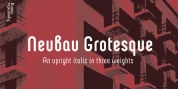
Designer: Quentin Stavinsky
LCT Palissade is in fact the research study of a history circulation, crossing through the commercial revolution and romanticism; the result of a strong letter type, solid, rigorous the drawing is orientated towards really dark, reminiscent of the characters starting XIXe. The serifs are the summary between the British characters from completion of (XVIe) and the Italian ones starting of (XVIIe). In order to expand the romanticism, they are really great to allow a largest contrast and keep the sophistication of the global shape.
Font Family: LCT Palissade
Tags: black, didone, display, elegant