Publisher: DizajnDesign
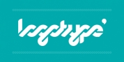
Rukou stemmed as a logo for a style designer. The idea was to make a fusion of a geometric typeface with the flavour of childish features. Rukou was inspired by school hand-writing models, but adds really particular and fascinating features to it.
Rather than concentrating on readability, the main goal was to have a special type texture. This is the reason lowercase is detached. The detached letters opened the possibility to develop the special shapes for specific letters.
The typefaces include two different designs inside one font style. You can select to set your titles in uppercase, or lowercase/titlecase. As each style has a slightly various texture, there is the opportunity to combine them in fascinating ways. The uppercase can even be embeded in little paragraphs.
Font Family: